AI + Design
AI + Design
The Subscriber Said Yes.
The Subscriber Said Yes.
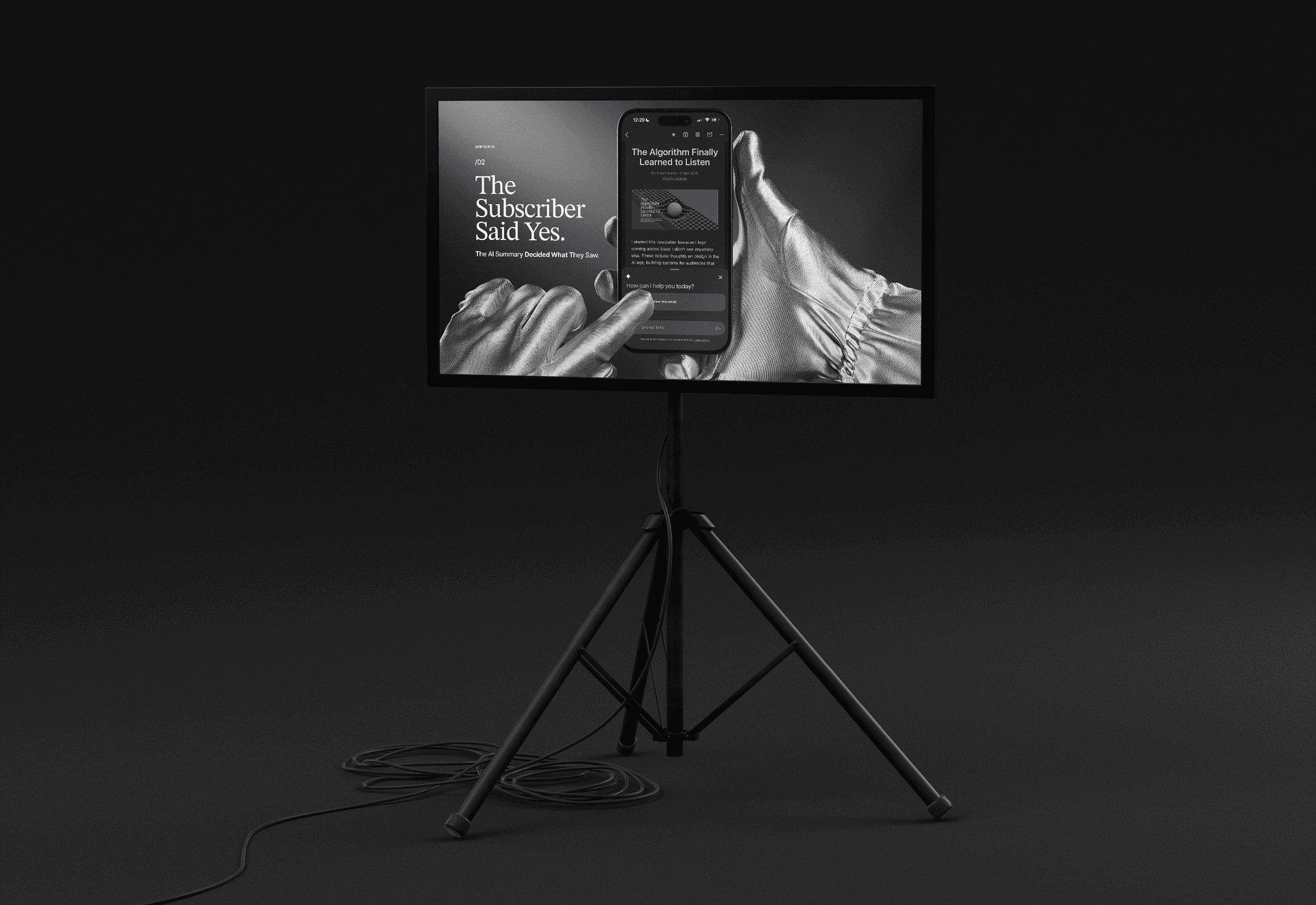
The AI Summary Decided What They Saw.
The AI Summary Decided What They Saw.
by
Sukari Keetin
Something I've been sitting with since last month at Unpacked 2026, Customer.io's online conference, where Action Rocket delivered a presentation on AI summaries in email clients. Their findings were specific, practical, and worth sitting with.
It connects directly to what I wrote in my last post: "Designers who know how to build for what users say they want, not just what they do, will shape what comes next."
The question is: are we designing for the people who are actually reading our emails first?
A new reader entered the inbox. Nobody told the design team.
In 1999, Seth Godin wrote Permission Marketing: Turning Strangers into Friends and Friends into Customers and changed how the industry thought about the inbox. His argument was that communications that are anticipated, personal, and relevant, delivered only to people who raised their hands, would outperform anything built on interruption.
The opt-in always had something quietly romantic about it. Think of the scene in Notting Hill where Anna Scott (played by Julia Roberts) stands in front of William Thacker (played by Hugh Grant) and says she's just a girl asking a boy to love her. The subscriber, in that moment, is Anna. Standing in front of the brand. Saying: I'm just a person, asking you to be worth my time.
For years, that opt-in was the foundation of the relationship between brand and subscriber.
Here's what nobody planned for.
The subscriber opted in. But before they ever read your email, an AI summary reads it first and decides what to show them.
This is already happening. Across every major platform.
The summaries aren't coming. They're here. And they work differently depending on where your subscriber reads their email.
Apple Mail generates a pre-open summary, written by Apple Intelligence and displayed automatically in the inbox, replacing your carefully crafted preheader text before the subscriber opens anything. The subject line your subscriber sees is no longer paired with your preheader. It's paired with whatever Apple's AI decided your email was about.
Gmail's Gemini generates a post-open summary, a condensed version of your email that appears after the subscriber opens it. As of May 2025, it's available in the mobile app for free personal accounts without a premium plan, and Gmail's AI Inbox is rolling out further in 2026.
Yahoo has integrated one-line AI summaries that replace preview text in the desktop view.
Apple Watch lets subscribers read those AI-generated summaries without ever reaching for their phone. Your email becomes a sentence on a wrist.
The permission model assumed one reader. There are now two. The subscriber opted in. The AI summary didn't
What AI summaries can and cannot read.
This is where most email design systems hit a wall, and where ActionRocket's research gets specific.
AI summaries read live text. They do not read text baked into images. They do not read alt text.
If your hero image carries your campaign headline as a designed graphic, the AI summary has nothing to work with. If your email is image-heavy with minimal live text, the summary either generates generic content or remains blank entirely.
The result: your subscriber's first impression of your email is not the one your subject line and preheader create together. It's your subject line paired with an AI interpretation of whatever live text your design happened to include, often a confirmation line, a legal disclaimer, or a footer element that was never meant to be anyone's first impression.
This is a design systems problem. And it's one of the most creative teams that weren't built for, yet.
The visual hierarchy you built for your readers is invisible to the system, generating that first impression.
Time efficiency is the real driver.
Permission marketing was never really about whether subscribers wanted to hear from brands. It was about respecting their time.
AI summaries are the subscriber's response to a world where their inbox outpaces their ability to manage it. They delegated the first read, not because they stopped trusting brands, but because they needed a faster way to decide what deserved their full attention.
Is this worth my full attention right now?
That's the question the AI summary is answering on the subscriber's behalf. And the answer is generated from whatever live text your email contains, regardless of where it sits in the visual hierarchy or what your design intended to communicate first.
What this means for how we design.
The email design system that performs well in this environment looks different from the one most teams run today.
Live text carries the primary message. Not hero graphics. Not designed typography in images. Actual HTML text that AI systems can read and summarize accurately.
Subject lines and opening sentences are doing double duty. They're written for the person who may open the email and for the AI that will generate the summary before they do.
Semantic structure matters. Front-loading your most important content, the offer, the reason, the action, gives the AI summary the right material to work with. Burying the lead is no longer just a copywriting concern. It's a rendering concern.
Testing is table stakes. Tools like Inbox Monster and Validity now let you preview how your email will be summarized across platforms before you send. That preview is no longer optional QA.
What I've been building.
These first two posts have been circling the same questions: what happens when attention is no longer the primary metric? What does it mean to design for a reader who evaluates relevance before a person ever decides whether to engage?
For the past several months, I've been developing a framework around exactly those questions. It's called Designed to Be Read, a framework for creative strategy in the age of agentic attention.
This is the work I do as a Growth Design Architect, designing the systems that determine whether content performs at all, not just tweaking individual pieces.
For the teams building those systems and the leaders commissioning them, the framework is a starting point for thinking about what the practice looks like from here.
Anna Scott had the courage to say it out loud. Your content needs a system that can speak for it, even when the room has changed.
The framework drops Wednesday. Subscribe to Hey! Sukari to get it first.
If something sparks a thought — or a disagreement — I'd love to hear it. Share your thoughts or insights at newsletter@heysukari.com.